Send With Confidence
Partner with the email service trusted by developers and marketers for time-savings, scalability, and delivery expertise.


Time to read: 8 minutes
If email’s the baited hook, the email capture landing page is the sturdy and trustworthy line that allows you to reel in prospects to complete a desired action—e.g., completing a sale, downloading an ebook, requesting a demo, subscribing to a newsletter, or something else. A catchy headline and a juicy offer may be enough to entice the email recipient, but moving from interest to action isn’t always a given. Done right, adding a landing page to an email marketing strategy can alleviate concerns, answer questions, and provide extra depth to inspire customer confidence.
Simply put, an email marketing landing page whisks prospects from their email inboxes to a distilled-down homepage. Linking from email to landing page allows you to keep email copy minimalist and invite interested prospects to learn more and take action on a beautiful page streamlined to engage.
Email marketing sequences include dedicated landing pages to build trust and nurture relationships by:
At a glance, email prospects understand what you want them to do and what value your business provides. Like a newsletter landing page, you can segment email offer pages by audience, campaign, or marketing objective.
Use landing pages to encourage any number of actions, notably:
Whether you launch a new product or create a more personalized sales funnel, email campaigns and landing pages seamlessly pair to supercharge conversions.
There’s room for all brands to optimize. Proof in point: the average email landing page converts at a rate of 2.35%, but the top 25% of sites convert at 5.31%, with the top 10% converting at 11.45% and up. Consider these email landing pages best practices to create higher-converting campaigns.
A landing page headline communicates clear, concise value. With the average visitor bouncing off within seconds of arriving, your headline’s chief objective is to convince people that staying is worth their time. Your headline should make a simple yet compelling first impression.
Great email landing page headlines:
Strong landing page design provides continuity and solidifies trust. Before email subscribers act, they must feel confident they’ve made a wise decision by following the link. They want to know they are closer to reaching the desired offer and didn’t click on spam by mistake.
The email marketing message and landing page should contain matching:
Email providers often limit the size of graphic attachments. By contrast, landing pages offer a world of possibility, from video to oversized graphics to parallax-style scrolling. Keep in mind that customers are 80% more likely to read marketing content when it’s interspersed with colorful graphics. At the same time, bounce rates decrease 32% from a 3 to 1 second in loading time, so it’s best to prioritize speed and simplicity over elaborate design.
The best graphics are:
An email landing page is the appropriate tactic for next-level information sharing and credibility building. But only insert links to relevant internal pages—rather than filling the main landing page with excessive copy. You want clicks, since web users who click at least 2 links are more likely to convert to a sale.
Consider inserting links to the:
The CTA is the most important element on your landing page as it’s the most direct path to the desired outcome. Be clear about what you want visitors to do now that they’ve come to your page. Rather than designing a default CTA, consider using data to craft personalized CTAs, which perform up to 202% better.
The best CTAs also:
Humans like social proof—which is why over a third of top landing pages use testimonials to build trust. Increasingly, brands appeal to new customers by providing reviews from past purchasers that validate the offer. You might think of this section as a “humble brag.”
Email landing page social proof may include:
There’s no need to reinvent the wheel. A conversion-focused template customized to your brand offers an easy way to debut a professional design without spending excess time or budget. Like a Lay’s potato chip, why stop at one? Grab a handful of landing page templates and see which ones perform the best.
We recommend A/B testing the following elements, one at a time:
Testing and retargeting your landing pages can increase conversion rates by up to 300%, so it’s worth the extra effort—like adding dip to your chip.
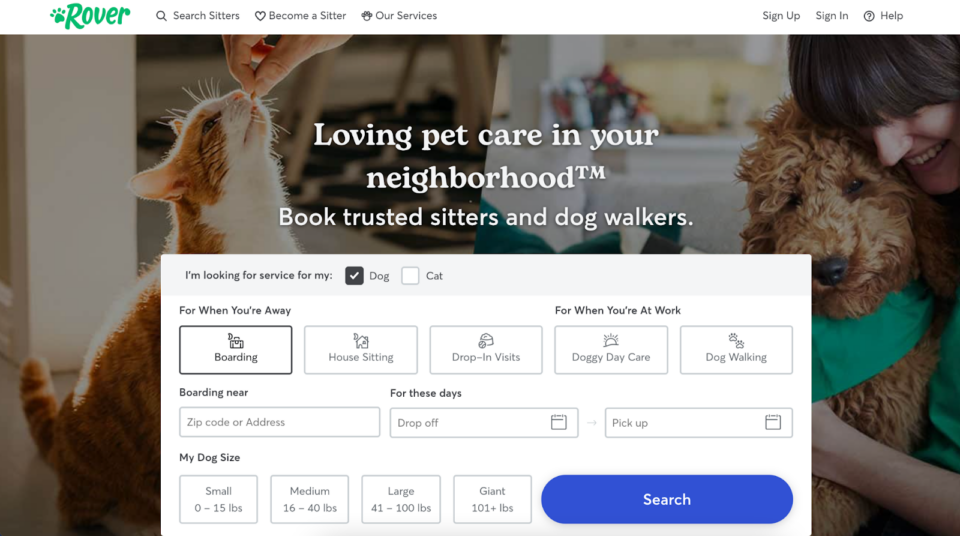
Now that you know the basic elements for a fantastic landing page, let’s move on to a few concrete examples that show precisely how all these theories work in practice.

What you can steal:

What you can steal:

What you can steal:

What you can steal:

What you can steal:

What you can steal:
None of these email marketing landing page examples are perfect in every respect, but it’s interesting to see how top brands apply unique spins to offer page best practices.
Want to get started with a landing page to complement your email marketing campaign? Sign up for a free account to get started—no credit card required.
With Twilio SendGrid, you’ll create and test marketing campaigns and access ready-to-use templates for email marketing messages and email capture landing pages. Intuitive tools make calculating email return on investment and boosting conversion rates almost effortless.
Partner with the email service trusted by developers and marketers for time-savings, scalability, and delivery expertise.